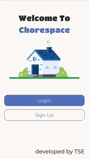
chorespace
Helping college roommates keep each other accountable and motivated to tackle chores.

my role
UI/UX Designer
team
4 UI/UX Designers
1 Mentor
timeline
10 weeks
summary
I completed this project as part of Triton Software Engineering’s TEST program, where my team and I were tasked with finding a prevalent issue in our community and designing a solution.
After exploring different issues, we found out that many of our peers at UC San Diego had similar issues revolving around chores and their roommates.
the problem?
When it comes to college roommates, chores such as cleaning, dishwashing, and taking out the trash can quickly become sources of frustration, leading to conflicts and tension.
the goal?
To design an app that tackles the challenges of distributing chores between roommates in college, and encourages conflict resolution and accountability.
empathizing with college students
PRIMARY RESEARCH
Although there are many chore and task tracking apps already out there on the market, not many of them cater specifically for those living with roommates. I wanted to tailor this app specifically for our target audience: College students!
So to empathize with our target audience, we conducted 5 user interviews and sent out a survey that received 22 survey responses with current college students living with roommates to determine common pain points.
PATTERNS WE FOUND…
From our interviews and survey we found a few pain points that stood out the most!
Disorganized distribution.
80% of students interviewed did not have a system for keeping track of chores leading to unequal distribution in chores or confusion on who is handling certain chores.
Lack of Accountability.
60% of students interviewed stated that they have at least one chore they rotate amongst roommates, but often "forget their turn for chores."
Awkward Confrontations.
Students reported that reminding roommates about chores felt “passive aggressive” and will “avoid it when possible” to prevent awkward tension.
ideating features
USER FLOW
Using the insights from our research we came up with features we wanted to implement into our app that would solve the common points of frustration we found with our user testing. Following that, we created a user flow to visualize user interactions.
Features:
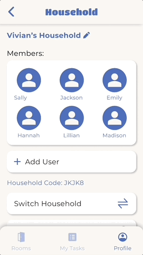
"Households" so all members of a household can view each other's tasks
Dashboard of your individual chores
Dashboard of chores organized by location in house
Chore setting to set frequency and rotations
"Poke" button to remind housemates about chore

low fidelity wireframes
We began by designing low fidelity wireframes that focused on capturing the main features and ensuring we were designing for usability.

design system
As we iterated through our wireframes by providing feedback to each other, we also started exploring colors and fonts for our designs.
To ensure consistency throughout all our designs as we moved into high fidelity, we created a style guide and components to use across all our screens!
STYLE GUIDE

COMPONENTS

solution
The MVP (Minimal Viable Product), our very first version of Chorespace!

moving onto version 2
USABILITY TESTING
After our very first prototype was finished, we put our design through usability testing where we had 12 users complete 3 different tasks to assess the usability and intuitiveness of our designs.
Through 12 rounds of usability testing, we determined areas of improvement for our version 2.


further testing
A/B TESTING
Once we determined the major areas of frustration, we also conducted A/B testing to explore minor interactions and flows more in depth. One flow we were having trouble with was how users would join a new household after leaving their current one.
Flow option A allowed users to make their own choice on which new household they wanted to join, but involved more steps as a trade off.
Flow option B reduced the steps by automatically switching the user to another household in their account in order of the most recently opened household. However, this eliminated giving the users a choice, which we predicted would cause more people to prefer option A…
Flow Option A
User manually makes decision on which household to join
Flow Option B
User automatically switches into a different household
A/B TESTING INSIGHTS
We found that the majority of people preferred option B and actually favored the reduced amount of steps and being allowed to just switch to another household if they wish to after joining, rather than being forced to make a choice.
80% favored B
simplicity over choice
20% favored A
final solution

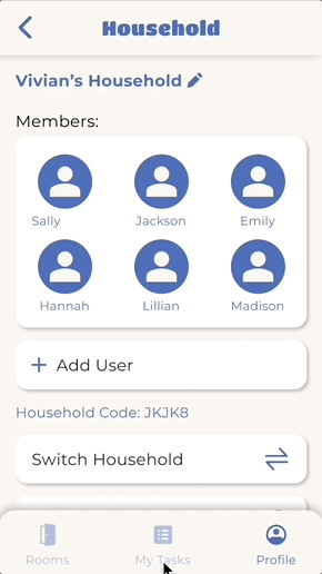
Rooms Page
Dashboard of rooms in a household
Users can see how many chores are uncompleted in a room
Add new rooms
Edit or delete current rooms
Rearrange rooms through drag and drop

Profile Page
Change profile settings such as notifications and account information
View task history
Manage your households
Onboarding
Login/signup
Join households through a QR code or text code

My Tasks Page
Dashboard of individual chores
Create tasks
Check off tasks
Filter to rearrange task list view
next steps
DEVELOPER HANDOFF
The designs have now been handed off to our TEST developers who have been working hard to turn our designs into a tangible product.
RESPONSIVENESS
Some of our big next steps would be to design for responsiveness. We started off with our smallest breakpoint, 320px, to ensure our designs would be accessible on all mobile devices and so we could scale up. Moving forward we will be working to design for our medium breakpoint 375px and large breakpoint 414px.
what did i learn?
BUILDING FOUNDATIONAL FIGMA SKILLS
This was one of the first projects I had ever worked on in Figma, so I spent lots of time outside of team meetings, teaching myself Figma and learning from tutorials, until slowly I got familiar with auto layout, components, and prototyping!
BALANCING FEASIBILITY AND USABILITY
At first, we had an idea to create a trade board so that users can switch chores. However, as we started determining our main goals, I realized this feature was not feasible under our timeline, so I chose to focus on designing the main functions and ensuring our main features were usable.
CENTERING MY DESIGNS AROUND DATA
I learned from this project that user data is crucial in keeping designers grounded and not make assumptions about our users. By utilizing user research to inform my design decisions, I was able to create a solution that directly addressed our user needs and pain points, improving overall usability and satisfaction.
what i would change?
ESTABLISHING A DESIGN SYSTEM EARLY
Looking back, I would've liked to establish a concrete design system early on. We were having difficulties throughout the project with small inconsistencies so having that design system to reference early on would've helped us to streamline our workflow as we ideated.
EXPANDING OUR USABILITY TESTING
If I could go back to improve any step of our process I would've liked to conduct more usability testing on our flows in our MVP and continue to test with our V2 designs to help us determine the most intuitive user flows.