UCSD Health: E Bike Safety Course
Role
UX Designer
Team
5 UX Designers
1 Project Manager
8 Developers
Timeline
Sep 2024 - Jun 2025 (10 months)
Index
Defining the Problem
Designing the Solution
Our Next Steps
Reflecting on the Process
TLDR
Over 10 months, my team and I collaborated with stakeholders and developers to research, design, and launch an educational platform for 9th to 12th-grade students to learn about e-bike safety, initiated by UCSD Health in collaboration with Rady’s Children’s Hospital and San Diego Safekids coalition.
Defining the Problem
Background
Justin’s Story

Our Client, Dr. Justin Assioun, an emergency pediatrician at Rady’s Children Hospital is a victim of an E bike road accident.
With the rising popularity and accessibility of e-bikes, especially among young teens who lack road experience, accidents have become increasingly common, some fatal.
Now, Justin is using his story to drive awareness and advocacy for improved safety education in the Encinitas area.
The Problem
Creating a Digital Solution Where None Exists
Currently, there is no method to track progress and engage high school students through an online certification system about E Bike safety practices.
So...How Might We
Design an engaging, interactive learning experience for E bike users that fosters road safety awareness, promotes responsible riding habits, and empowers users to navigate shared spaces confidently.
Designing the Solution
Our Solution
An Interactive, Engaging and Credible E Bike Safety Course

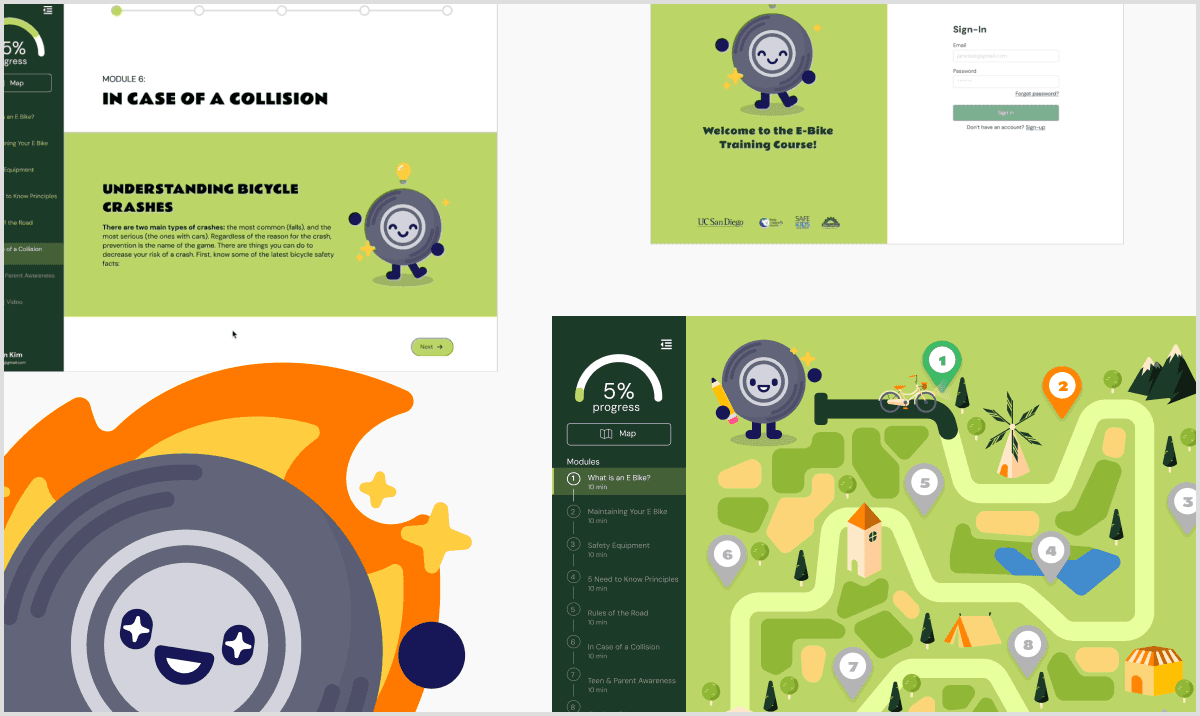
Nice to meet you, I’m Timmy the Tire!
Interactive Course
10 Modules of content broken down into interactions and animations, with a fun learning buddy to guide the way.
Journey-based Homepage
A simple onboarding process that leads you to a homepage that outlines your course journey with a cute map.


Knowledge Checks
Short quizzes at the end of each module to reinforce and test key concepts.
Completion Certificate
A certificate standardized from an educational and objective standpoint, earning after passing the final knowledge check.

Project Constraints
Some Challenges We Worked Around
10 Modules in 10 Months
With only 10 months to build an online course from scratch, we defined our scope and timeline early to stay on track.
Research Barriers to Target Audience
Unfortunately, we couldn’t directly reach our target high school students due to privacy concerns.
So to gather early proxy insights, we surveyed high school students within our own networks (family, friends, etc.) instead.
Work-In-Progress Content
Most of the course content was in development while we were building the MVP.
Working with only a fraction of the final content, we prioritized recyclable designs that could easily adapt to new content.
Research
User Surveys: Initial Research
To start off our research, we created and sent a survey to 13 high school students to uncover what types of content or experiences feel most engaging to them.
The Data

Competitive Analysis: Looking at Similar Tools

Since a variety of learning platforms and courses exist already, we assessed what similar tools were already doing well, where they were lacking, and we could differentiate our designs to address these shortcomings.
We also tracked common features across platforms to see what functions our users expect and are used to.
Competitor Strengths
Short quizzes to reinforce learning
Micro-interactions (Hover, text effects, etc.)
Animations for engagement and cohesive feel
Content broken down into smaller bits
Competitor Areas of Improvement
Limited interactive elements
Minimal graphic elements
Learning exercises/interactions are too repetitive
Hard to track progress in the course
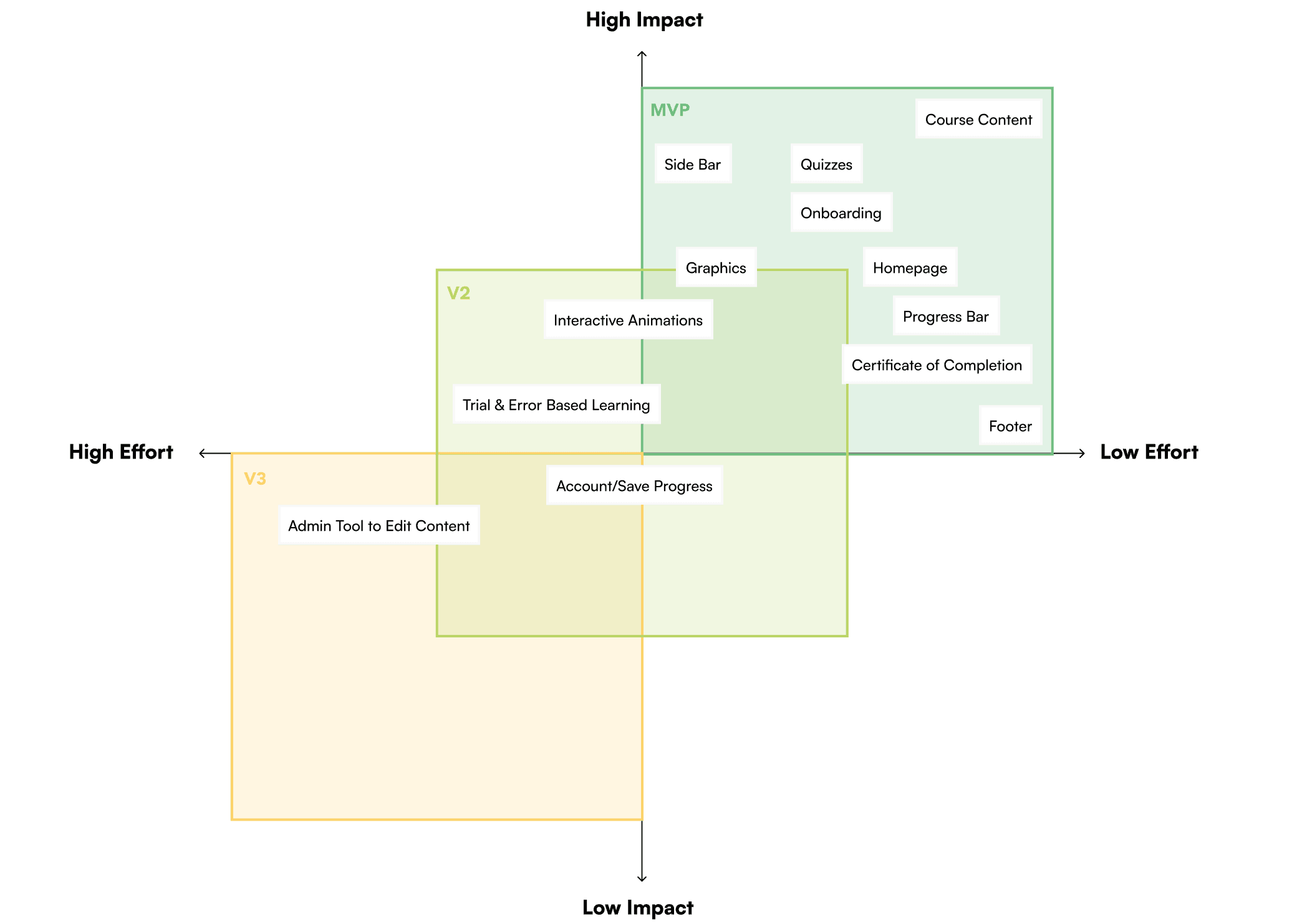
From our competitive analysis and data, we focused on the features that best met our users’ needs. To make decisions easier, we collaborated with our PM and developers to map each feature based on its impact and how feasible it was to build across MVP, V2, and V3.
User Flow
Mapping the User Journey
Next, our features were translated into a user flow to visualize the steps students would take within each module and the entire course.
This ensured the features were accessed intuitively and flowed smoothly.

Design
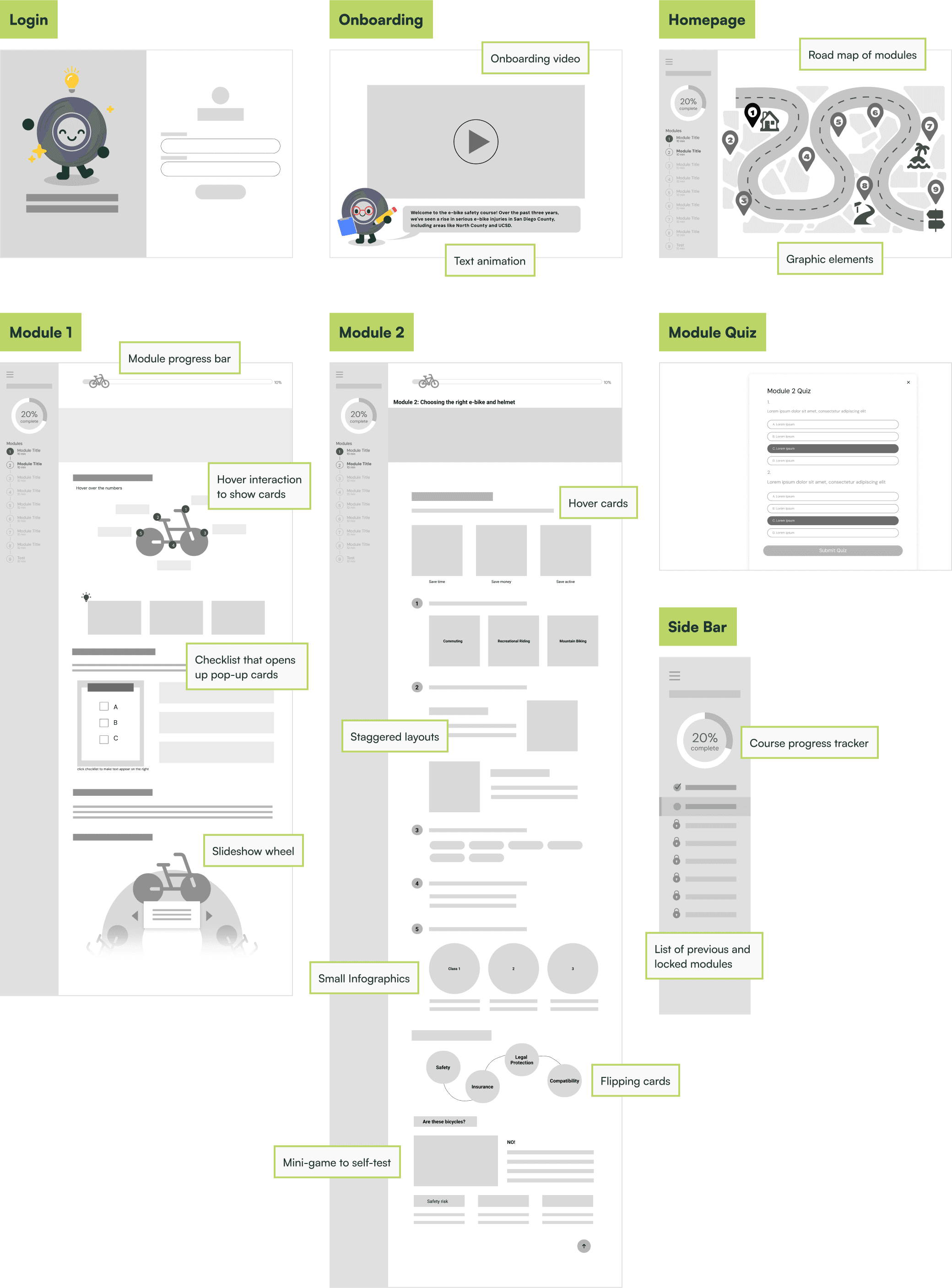
Low Fidelity
In low fidelity, since we were only working with 2 modules worth of the content, our priority was to focus on whole-course features and design for adaptability and reusability. During this phase, I also tested out many different types of iterations and animations not only for the first 2 modules, but future ones.
Key Design Decisions
Engagement Using Interactions
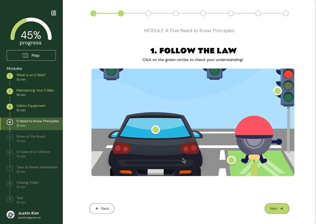
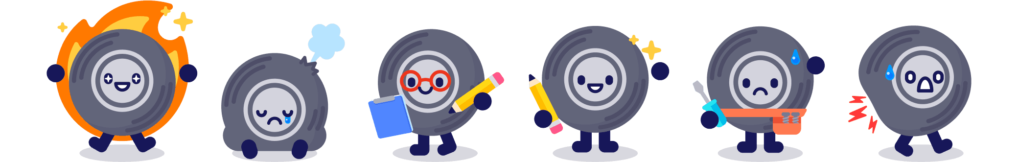
Data revealed that student’s enjoy story/character driven animations, interactive elements, and real-life simulations. So, we translated that need into fun interactions and graphics to make information as engaging as possible, each vector created by hand. Here’s some of my favorites that my team and I worked on!


Importance of Progress Indication
Knowing that progress indicators in online courses are a common feature among competitors and an expectation from our users, we designed two ways to measure progress to help build a mental model of where a student is within the course.
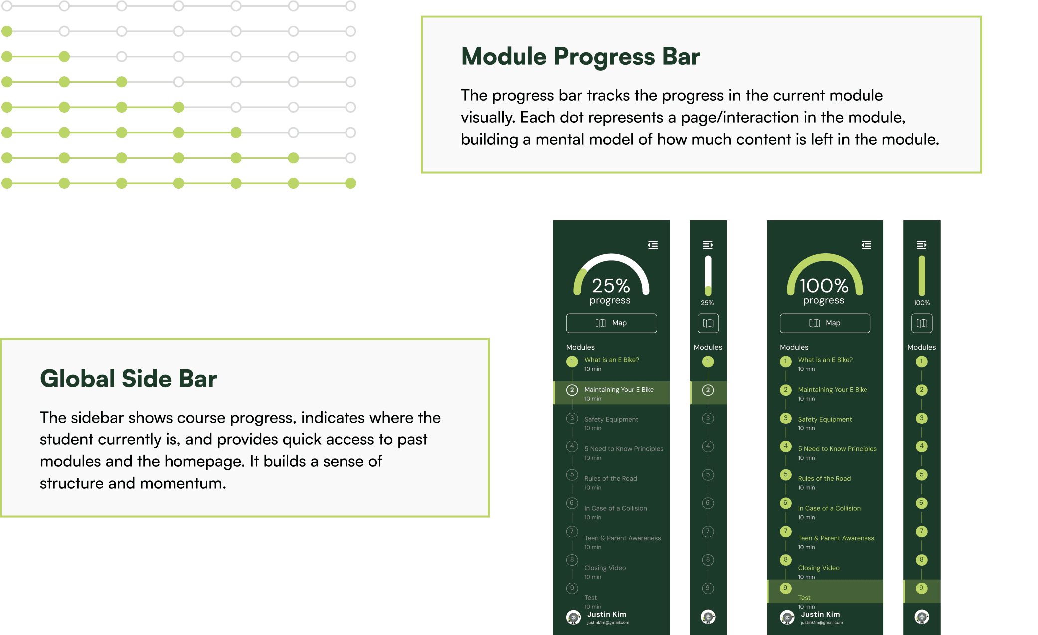
Switching from Infinite Scrolling to Pagination
Usability testing showed that long scrolling pages felt overwhelming and cluttered, with users often scrolling past interactions, whereas separating content into pages made it easier to digest and encouraged users to complete all interactions.

Visual Identity
Building the Branding
To build a visual identity from scratch, we first did a massive amount of moodboarding, slowly converging into one visual tone. A lot of greens and fresh colors were chosen for a whimsical, yet outdoorsy theme to fit the E Bike aesthetic.

Timmy the Tire
Of course, a fun educational learning platform wouldn’t be complete without a mascot. Timmy the Tire was first a sketch I made messily on some sketch paper, exploring different emotions to strike a connection with students.
His final design features a multitude of emotions to make the learning experience more playful and help guide students through the course.
Visual Identity
Designing for Consistency and Scalability
Because reusable templates for future modules were a big challenge for this project, establishing our design system early was key to designing efficiently and delivering designs on time.
Typography, color, branding assets, spacing, and UI elements were organized to be easily referenced and accessed for scalability and consistency, especially since we designed for responsiveness.

Usability Testing
Implementing Feedback
As we iterated through MVP and V2 designs, we conducted usability testing on 20 participants for both phases to uncover areas of improvement.
Participants were given 2-3 minute long tasks and were encouraged to openly share critique and feedback as they worked through the task.
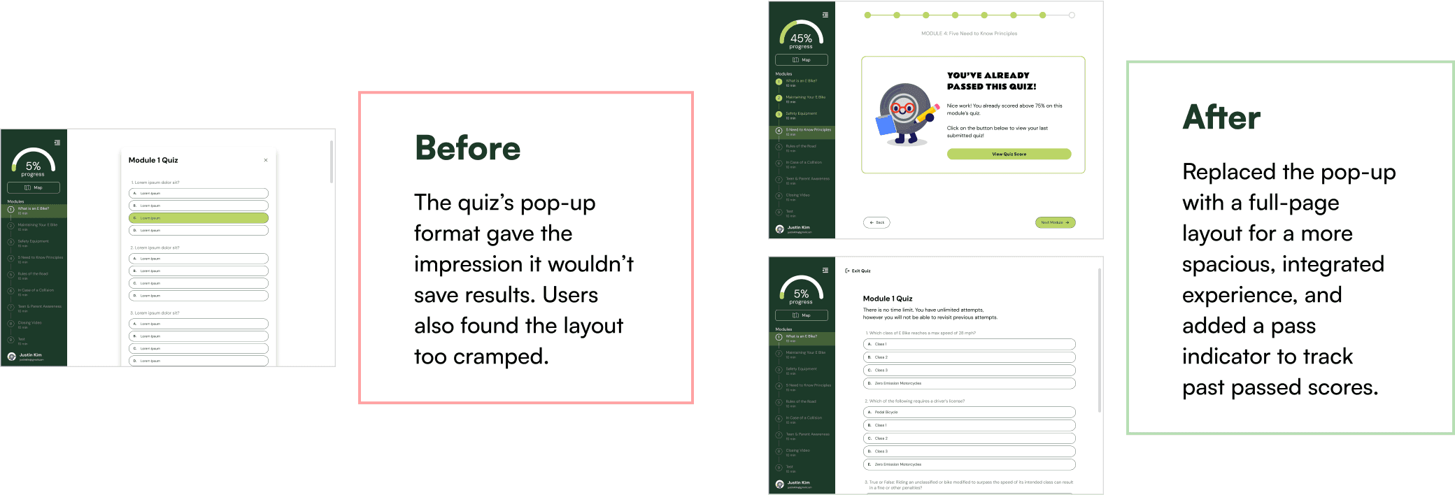
Dividing Up Conflicting Actions

Clarifying Instructions for Interactions

Streamlining the Quiz Flow
Our Next Steps
Engineering Handoff
Launching Fall 2025
Throughout the project, we met weekly with our developers to share design updates and check progress. For both the MVP and V2, as we handed off our designs, we reviewed the implementation, caught any visual issues, and requested revisions as needed, staying organized over update tracker documents.
Metrics
Collecting Quantifiable Impact
To measure impact, we are working with our developers to track accounts created, certificates earned, and average quiz scores per module to gather quantifiable numbers to roughly measure impact. Some other metrics we plan to measure in the future if feasible are time spent per module and conducting more user testing from high school students.
Measuring Success
Our long term goal is to see a decrease in local E Bike accidents in the Encinitas areas by an improved knowledge of E bike safety post course. Ideally, with access to sufficient tools to support comprehensive tracking, we will measure success through improvements in pre- and post-quiz scores, positive feedback and post-course surveys, and high course completion rates, as well as adoption of this course in more schools and counties.
Reflecting on the Process
What I Would Have Done Differently
Looking back, I would’ve established clearer guidelines for responsiveness earlier. Since we considered it after we had mostly established our designs, it was harder for us to scale down and we had to do a lot of extra work to redesign components and discuss with our developers .
I also would’ve prioritized more in-depth user research, explored animation options sooner, and set clearer expectations with the client from the start. With such as large project, it was difficult to balance expectation and feasibility. Even though we had set a clear scope, it would have been beneficial to define it in more detail, such as what animations were possible and feasible with the most amount of impact. Animation and prototyping that many different interactions is a lot of work and should be considered in-depth!
I also learned it the hard way that when you have a massive amount of types of animations and interactions, standardizing the components and types of interactions at the start is key for a cohesive feel and look.
What I Learned
After designing interactions and prototyping animations for 10 months, I’ve learned that micro-interactions aren’t so micro.
The subtle details are what make the experience go from good to amazing. It’s important to justify and think about why you are choosing to include an interaction and how. Not only are they guiding your users, they add engagement and another level of play!
And while the details are important, it was also super easy to get lost in the smallest things. Big-picture thinking shapes better experiences, it ensures consistency and cohesion across modules and formats, so it was crucial for me to learn to back up and look at the whole picture while designing.